← Back
Portfolio -
(Product) Design
BetterCloud
Product Designer
2024 - Current
Alight
Product Designer
2021 - 2024
Alight is a SaaS company that mainly focuses on how software can impact human capital and how it can be simplified for companies. It takes into account all of the aspects a company might want to offer its employees and packages them on a functional platform called Alight Worklife. This system simplifies some functions like health, wealth, payroll, and leaves so there is not much hassle in how to administer this in your organization. In my time at Alight, I worked on several projects ranging from UX work around personalized functionality for most of the users/employees, and even more prominently, I led the design work on the in-house customer care platform as the single designer on the project. My work on this platform was to maintain a coherent link between the custom page and component designs and the main design system while accounting for some custom features the user-facing software would not implement.
I was responsible for looking into the UI, UX, and some research elements so the development team could complete the desired outcome while working hand in hand with the product team so any changing requirement could be accounted for and worked in the context of the general platform design. So there was an internal design system (for the project) that had to be maintained similar to the user-facing one and both platforms could have a similar visual and functional language.
LearnAla
UI / UX Designer
2020 - 2021
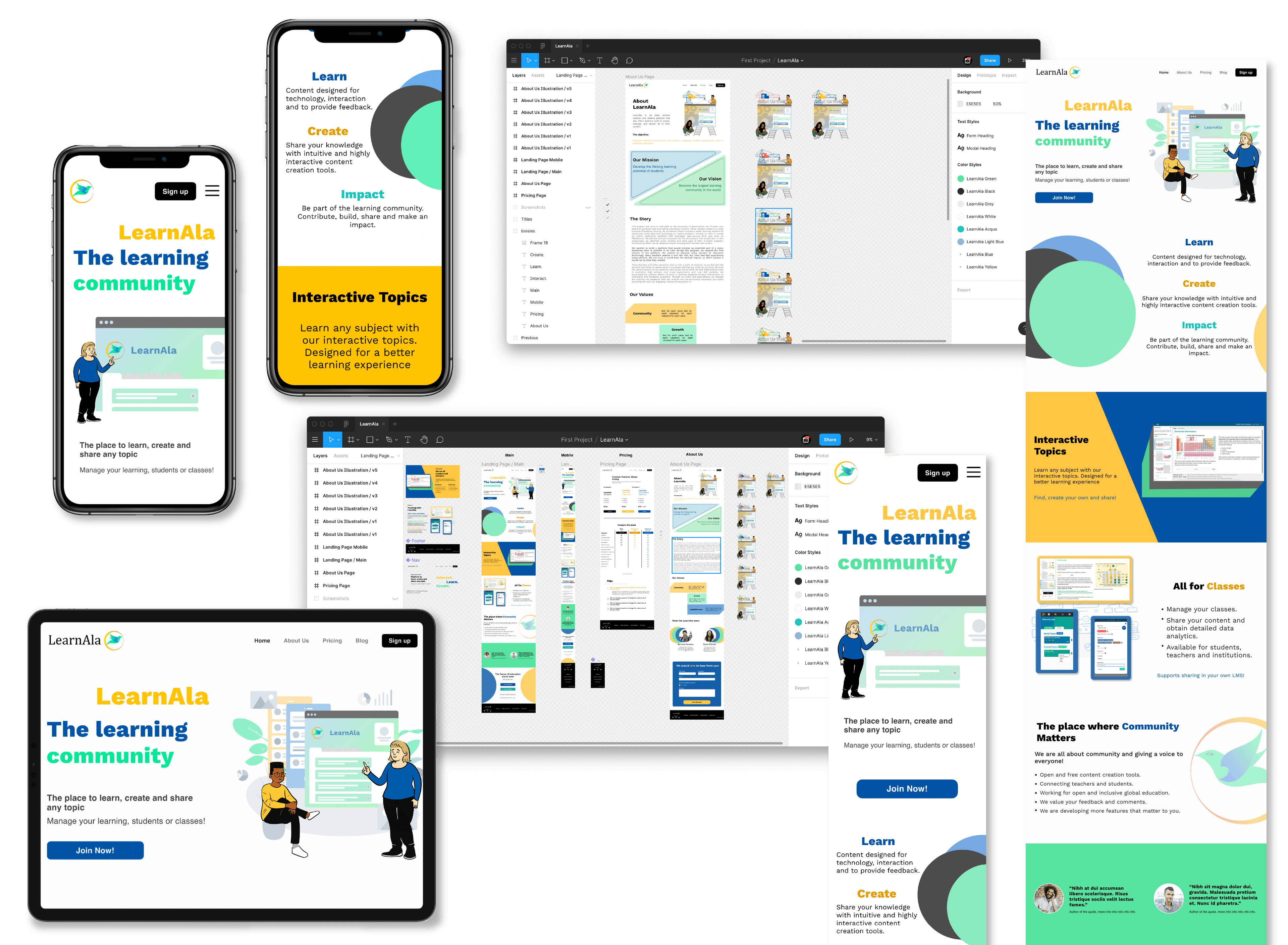
LearnAla is a community based educational tool which mainly intends to function as a content creation and consumption platform where teachers and students are connected and given the opportunity to research any topics of interest (or create them in the case of teachers). I joined in a design capacity to help polish and redesign some elements as a UI / UX Designer for visual and functional updated the partners needed on the platform.

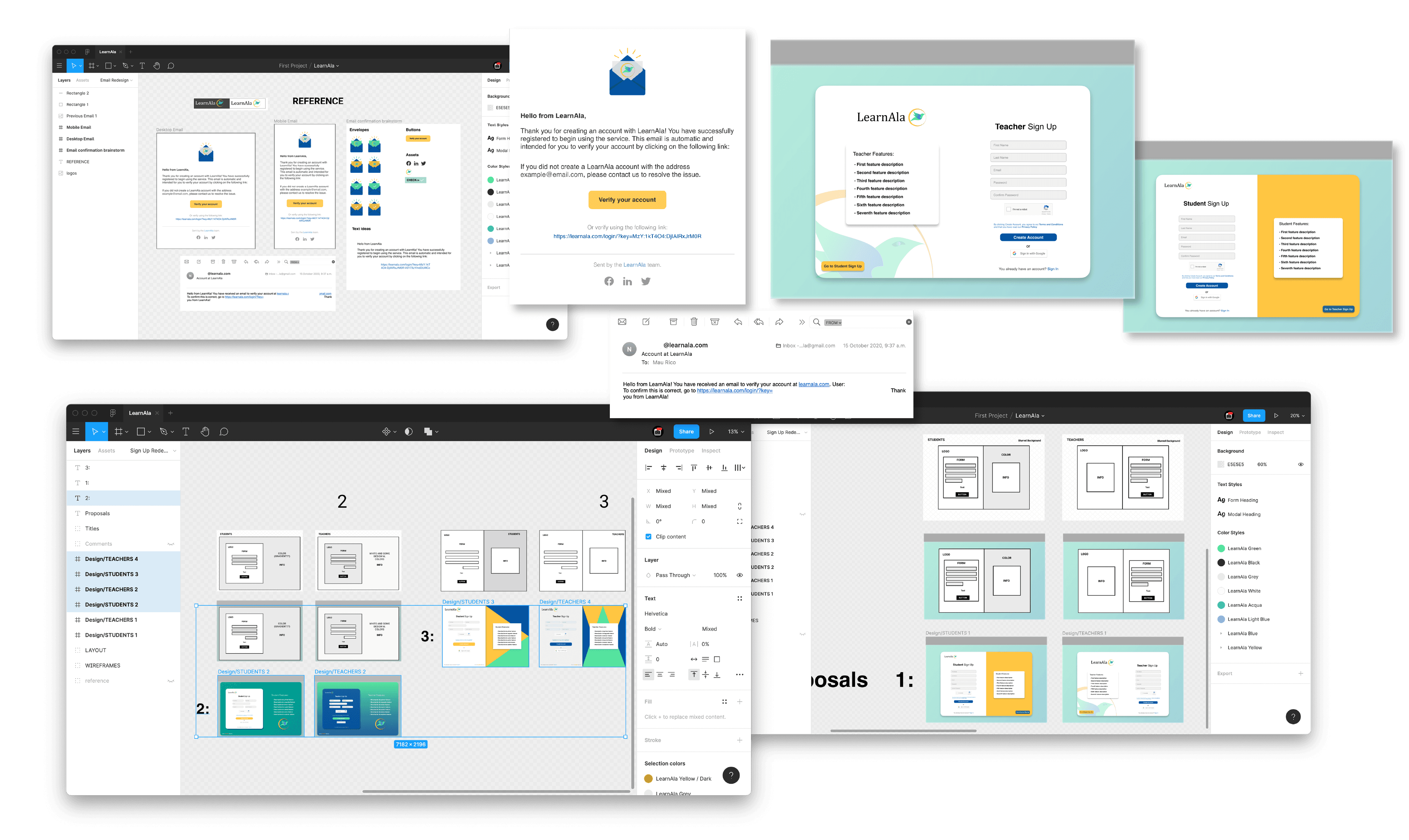
In my time working at LearnAla, my basic function was to closely consult with every member of the team when deciding new functionalities or update previous designs and work with the design team to create and prototype them. At the very start of my time on the company the project was already underway so I was able to learn and reference from previous design patterns and rules like the pre-established colors, typography and components that the development team where able to code and create. The first re-design I was able to do was with the confirmation e-mail interface after creating a LearnAla account, the previous e-mail format was more of an automated text response so while using some references of current design trends for these types of confirmations for the users I was able to polish and have a "friendlier" first step when communicating with the user.
The next two projects that spanned the rest of my time at the company where the update to the main landing page and incremental updates and features on the system itself. Some of the concepts, images and screenshots included are part of these updates so because of the nature of the development process some of the other features I was able to design with the rest of the design team are still in development so I can't share them on this current portfolio.

As it pertains to the tools used in the processes of ideation and design, the tasks were maintained and organized via Trello to keep projects clear and so that everybody could get their respective work done at the proper time. From the design side, all of the ideation and simple wireframes were put together with the designs and some prototyping using Figma.
Web design & development
Freelance Work
2017 - 2020
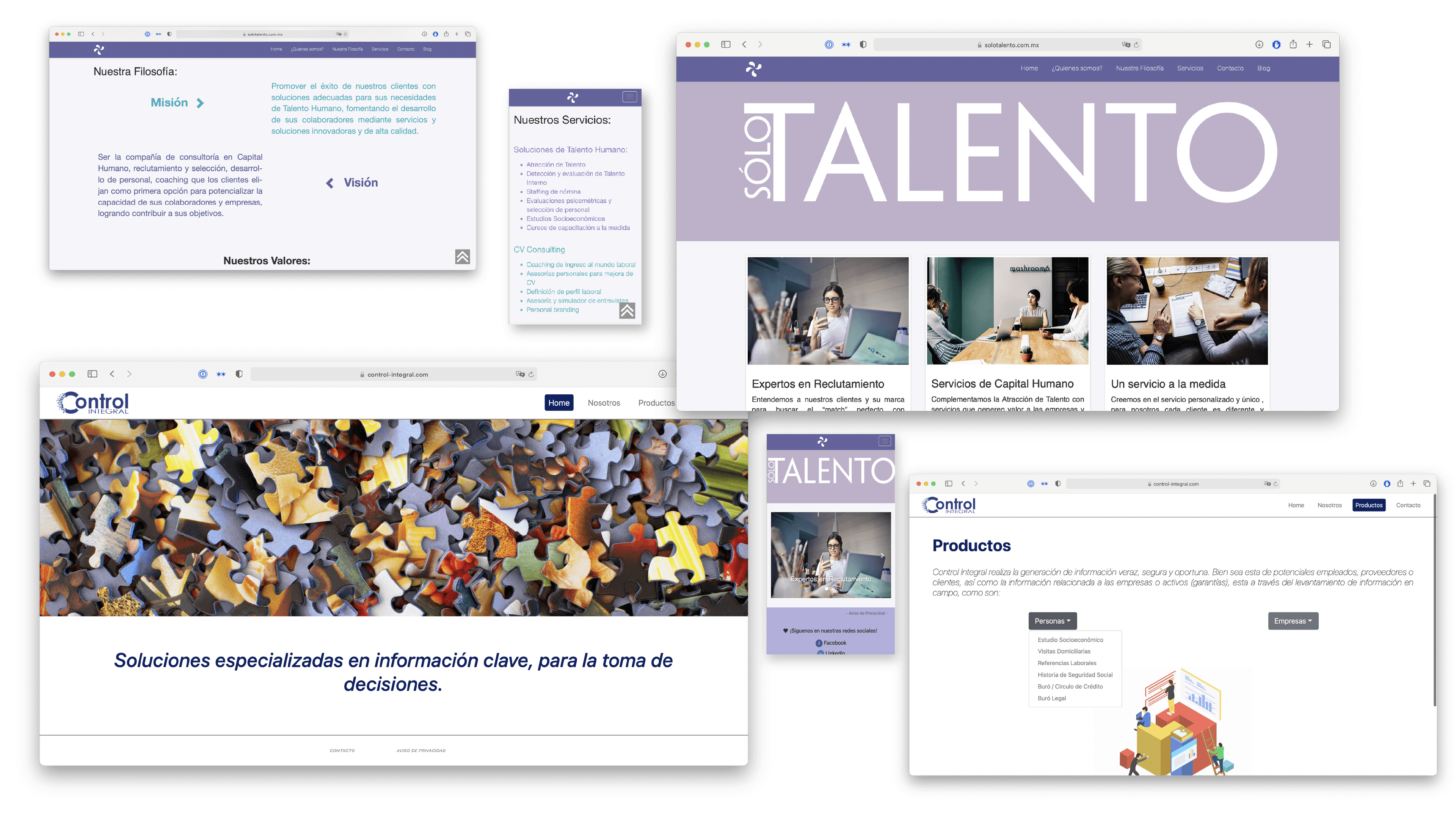
Before leaning more into digital design I began as a freelance programmer while I attended school , developing static websites with some reusable components. The two main projects I worked on this capacity were for Solo Talento and Control Integral. The two projects here are displayed as a pair because of the similarities both of underlying technology (React JS and Gatsby JS) on the dev side and the general idea of simple static websites with minimalist designs.

Solo Talento is a Human Resources consulting firm that focuses on providing their clients with services ranging from recruitment and training to payroll administration. The main concern when designing and developing the website for the firm was to have a site that would be fast and efficient while handling simple information. That is why the idea behind the static website came from. In order to develop this site in a relatively short amount of time I used React JS
Control Integral on the other hand, is a company specialized in gathering, analyzing and measuring information related to labor, commercial and credit risk. In this case, the technology used to develop was Gatsby JS. Gatsby is similar to React as it works with components and actually uses some React libraries but some underlying differences that I wanted to try with this project.
For both of these projects the design was basic, wireframes by hand and some work on Sketch but mainly consisted on the development and coding of the websites. It was the beginning of getting to know the design process aside from the more technical development.